Two of Twelve

February. The shortest month of the year. I never spell this month right on the first time. And it’s the month that football ends. At least it ended well this season with the Raven winning the Super Bowl. We love watching football on Sunday afternoons with a fire going in the fireplace. This is the month that I wanted and hope for  snow. We only dusted with snow that barely covered the grass a few times. Ans yet, February is also the month when I begin to look forward to spring. It’s the month of chocolate, flowers, and love. We grabbed our two of twelve this year on Valentine’s morning as we headed out the door for Pre-K. We had a lovely day celebrating together, continuing traditions, and making pretzels. ENJOY!!!

you need some chap stick if you are going to KISS a cow!a favorite chocolate treat from Trader Joe’s!Thanks to pinterest for this simple decorating tip and to my mom brought me flowers!Strawberry milkshake with lunch: our traditional egg salad sandwich in a heart shape..

Thanks to a good friend we used this pretzel recipe. You can find it here. (I used half whole wheat and half white flour)

and one picture on the self timer of me and my girl!

. . .. . .. . .. . .
monica

Awesome Post! Love is worth celebrating and you guys are bursting with it. thanks for sharing a part of your secret life as a family.

Very fun. I love Valentine’s Day! And the Gov’t Mule we didn’t get to try the one time we went to Woodberry’s because they didn’t have the ingredients! We’ll have to go back to try it!

Elizabeth Reich: Baltimore Residence (part two)

We continue today with more rooms that Elizabeth Reich of Jenkins Baer designed for this Baltimore residence. If you missed part one you can view it here. You must remember that this space was completely bare when Elizabeth began meeting with her client. The walls painted white, the floor plan open, and no architectural detail in any of the rooms. Again, it is Elizabeth’s talent and skill to create and design a space that is cohesive, classic, and a place to call home. I hope you take your time looking and seeing the layers in each room and the beauty in her design. I fell in love with a lamp that is in the Study. I wanted to make sure that you too take look at it. Thank you Elizabeth for spending the day with me as I photographed these beyond beautiful rooms: Living Room, Sun Room, and Study. ENJOY!!!

First, the Living room. The design started with the desire to have a comfortable  room for TV viewing

and a place where he could sink into a sofa.

The layers in this room consist of textures and shades of cream, chocolate and dark grey blues.The dark oval stone coffee table is the perfect contrast against the cream sofa in this room.

Additional seating was provided by the claw leg saddle stool with the leather top without visually blocking off the room.

The room is grounded by the chunky sisal rug that is bounded with an espresso border, adding texture to the room naturally.From the Living Room you walk into the Sun Room.

The day I was photographing this home I watched the snow fall from these windows; which let in an enormous amount of warm light.

The color palette: soft grey, gold and chocolate.

Sheer natural lines were used to dress the windows as to take advantage of the natural light.

The mirror was placed above the sofa to capture the water view from the living room.

A perfect place to read.

Last but not least, the Study.OK, so when I first walked into this room my eyes landed on this handsome lamp. Yes, handsome.

And they never seemed to leave it either.The dark rich wall color immediately creates a cozy feeling.The Study was created to be a room where Elizabeth’s client could be comfortable to both read and work.The desk was placed directly in front of the windows to take advantage of the views.

Elizabeth found a rustic table with metal legs which was the perfect fit for this masculine Study.

Contact: Elizabeth Reich

Jenkins Baer Associates
24 West Chase Street
Baltimore, MD 21201

Phone: 410.727.4100
Fax: 410.727.4130

. . .. . .. . .. . .

Elizabeth Reich: Baltimore Residence

By now you all should be familiar with Elizabeth Reich of Jenkins Baer Associates. Elizabeth is a talented designer who amazes me each time I step foot into a residence she has designed. This Baltimore residence started with white wall and ten foot ceilings throughout the home; a blank slate so to speak. Now what you will see are warm colors, patterns, comfortable seating, understood space, inspiration, hand chosen artwork and layers of details. Each room different and yet this bachelor pad has a cozy and welcoming cohesive feeling throughout. This is exactly what Elizabeth does best; create a custom space designed for each client and that truly reflects who they are.

As I set up my tripod and cameras to begin photographing each room; I first love to stand and gaze. I let my eyes wander around the room. They land on the soft fabric chosen for the couches and throws, the patterns in the pillows, then they are moved by the lighting, and then I stand amazed at the colors. How the all the colors compliment one another and make the whole room complete. It’s amazing and it puts a smile on my face! How much do I love my job? I think I have one of the best ever; with the best clients! Thank you Elizabeth for allowing me to capture your work! Today I will share the Sitting Room, Powder Room, Foyer, Dining Room, Kitchen, and Master Bedroom. There is more to come! ENJOY!!!

The Sitting Room was initially three bare walls with no windows or architectural details.

Mouldings was added and the walls painted with a deep blue.

Lighting was utmost important in this windowless room. The chandelier makes it intimate.

The powder room was designed to be a moody and masculine.

Kelly Walker of Baltimore Artstar painted the walls creating the depth and color.

The sink was custom built for the space with a black absolute granite and polished legs.

The inspiration for this room: a beautiful bone tray that Elizabeth loved.

The initial space for the foyer was too small for a table.

Instead they used the space right inside to place the table that was made of reclaimed Douglas Fir.

The iron base  is open and allows you to see through to the windows.

Words to describe the dining room: rustic elegance. It was achieved by using hammered zinc top for the table, and mixing two different chairs.Transiting from the dining room to the kitchen where the kitchen cabinets were already existing.

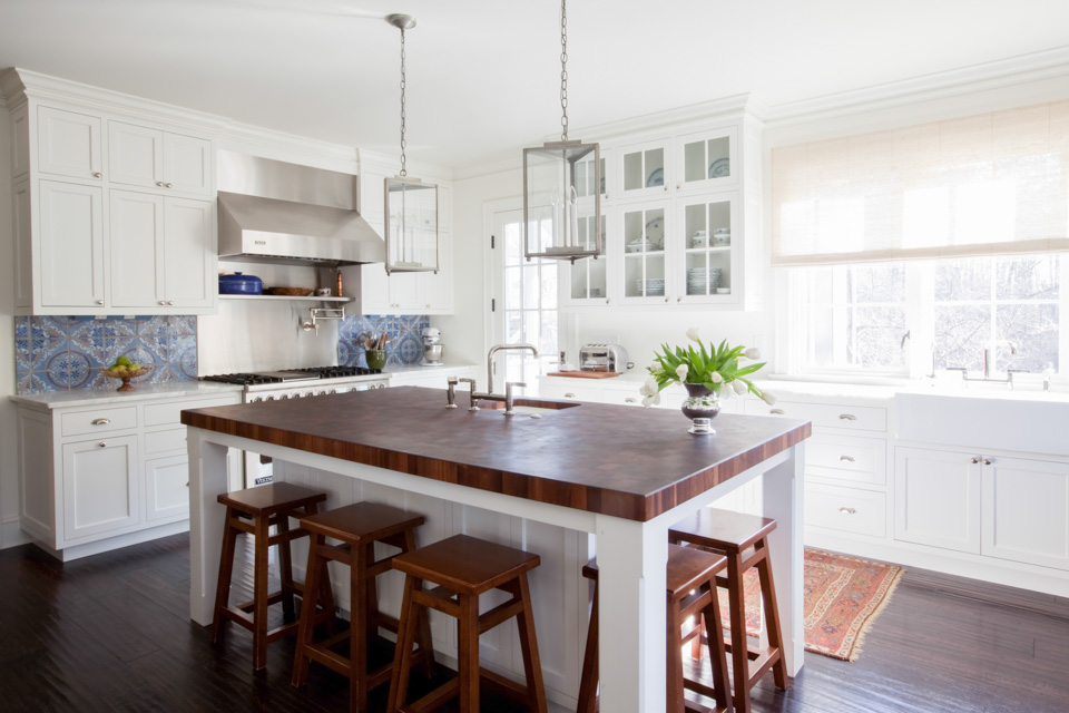
Elizabeth and her client added a casual breakfast table with a bench and chairs to double as an island.

Both of them loved the rectangular light fixture above the table.

 Elizabeth’s goal in designing the master bedroom was to create a serene retreat. The backdrop: gorgeous grasscloth on the walls in a

charcoal from Philip Jeffries. The other fabrics in this room provided textures; however they were kept muted.

Beneath your feet the pinstripe carpet added to the masculine feel in this room.


Contact: Elizabeth Reich

Jenkins Baer Associates
24 West Chase Street
Baltimore, MD 21201

Phone: 410.727.4100
Fax: 410.727.4130

. . .. . .. . .. . .

My Valentine

L O V E   O N E   A N O T H E R

(just as I have loved you,

you also are to love one another.)

John 13:34

HAPPY VALENTINE’S DAY!!!


. . .. . .. . .. . .
DE NEUMANN

You are such a great example of someone who loves one another! You are precious in His sight! Happy Valentines’s day to you!

Staging Shots

This post for today will be similar to the post about photographing ring shots. Today I want to expand upon on the last point of capturing rings or other details in a setting that reflect the couple’s wedding day. I will share how I go about photographing details to tell a cohesive story through the photographs.

1. One a wedding day I begin shooting the details first…wedding dress, shoes, jewelry, rings, perfume, veil, purse and any other items given to me by the bride. Always ask permission to move their image to a new location or if you can take them outside. Knowing the bride and the details she has already shared about her wedding I can get a feel for their style. Upon entering the setting or room I begin thinking where I want to organize and display their items. And let’s not forget about the groom. The same concept goes for him and his items.

2. I am always looking for natural light first, even when shooting indoors. A repeat tip is when shooting indoors; when possible use one source of light. Turn off lights!

3. Next I am looking how to stage their items. I am looking for an element or color or background or texture to help create a story to their wedding day. This element will help create a cohesive look for their wedding images. It could be lace in the wedding dress, veil, bride’s maid dresses, fabric from chair, wood floors…etc. When shooting I begin to think about their wedding album and how images can be paired to one another to tell their wedding story.

4. Once I have found where I want to display the items and how I want to stage them I start to clean up the background. I look through my lens and look for any objects, or colors that might be distracting in the background. I seek to remove them if possible or change my shooting position until the background is clean. This keeps your eyes drawn to the item that is the focus.

Here is one example showing where and how I created images to tell a story of Corrine and John’s wedding. I entered the church where she was getting ready and as I walked into the foyer area there were tall windows letting in diffused light. I immediately made a mental note that this would be an area that I would want to bring her items out as the windows created soft natural light, perfect for details.

Here are some other thoughts that help me decide how to stage Corrine’s details. I noticed burlap was used on her setting chart, and table settings. The color of Corrine’s hand made programs was in kraft paper, similar color to the burlap. They were having their first look and family formal pictures at a local farm. Their wedding experience was more rustic and earthy. I then set out to find a piece of burlap that I could bring into the foyer where the good light was. Burlap also created texture in the photographs. Once I found a piece of burlap, it was time to clean up the background. This time it was done by moving myself and changing angles.  Here are the details that were photographed using a small piece of burlap in the church foyer. I hope this was helpful in seeing how to create a cohesive look for your photographs during a wedding day! Thank you Chaucee for capturing the one of me shooting and for helping me stage the details! Enjoy!!!


The church foyer. The tall windows were behind me.

Notice in the picture on the left notice the red color showing up.

Once I noticed this in the background I shifted my angel to eliminate the red as it was not Corrine’s wedding color.I use the Canon 100mm 2.8L for these details.I love the bottom image..clean and simple.


. . .. . .. . .. . .