The owners of this waterfront home in Baltimore called upon designer Elizabeth Reich of Jenkins Baer Associates to design a home to feel like it has their personality in each space. Originally, the home was built by a customer builder for his family to reside in, however they never ended up living in it. Elizabeth and her eager clients first started changing the pale yellow walls with new paint color that was selected to suit more their style and personality. Elizabeth quickly moved room by room adding color, character, and a style that now makes her clients feel at home. Thank you Elizabeth for allowing me to photograph the homes you continue to transform with character, color, and style. Please enjoy the powder room, kitchen, family room, and master bedroom. Below Elizabeth describes the details that make up the design of each of these rooms.
 This room seemed to have the biggest transformation. It had a standard cabinet with green granite top,
non-descript flooring and basic lighting and mirror.
We switched out the chunky vanity to a sleek polished nickel vanity with a white marble top.
 We added sconces in a gilded finish beside the mirror for a more balanced light and took out the overhead sconce
that was originally above the mirror. We added a chandelier that is made of antiqued mercury glass which illuminates the room.
It has a metal wire mesh which wraps the globe and the mix of materials gives it a vintage feel.
A hexagon marble mosaic grounds the bathroom floor. The wallpaper was a special textured iridescent “sequin” paper that really glows in a steel blue color.
We even put it on the ceiling to envelop the room. The horn framed mirror added a sexy touch to the walls.
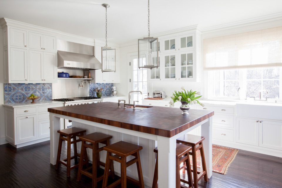
 In the kitchen they just wanted a nice place to have breakfast,
so we found a round pedestal table with a hammered metal top which is pretty and practical.
 The chairs have a rustic appeal with the burlap upholstery & wood finish, yet they are also somewhat
formal in feeling with their square back French style & nailheads. The drapery panels while beautiful really frame the windows and make you notice the view of the water in the distance.
We worked with the clients existing rug to get the colors for the space.
 They wanted this room to feel comfortable and relaxing, so we added two large deep sofas
with lots of pillows of different colors and textures.
The colors are navy, chocolate, grey & accents of purple.
 The wing chair in the corner by the window is a favorite reading spot.
Covering it in a fun graphic pattern gave this typically traditional chair a fresh modern look.


The cabinetry was good quality but it was in a pale wood stain.
We wanted to paint it a dark smokey blue to give it more of a rich and cozy feel (Ben More “Evening Dove”).
It completely transformed the room when we did that.

 The chevron Missoni pillows were a favorite of the client.

 The coffee table is pretty yet casual enough that they aren’t afraid to put their feet up on it.
The hide stools provide additional seating when they have a large group over.


 The large chandelier was unique and rustic and seemed perfect for the space.
 The Dining Room is the first room that you see when you enter the foyer & really welcomes you into the house.
We fell in love with the chandelier which is a combination of shell and wood pieces that seemed to work well
with the eclectic style of the room.

 The chairs were based on the Frances Elkins Loop chair which I have always adored.
 Originally this room had shades of gold on the walls above & below the chair rail.
We fell in love with the Tibetan rug which we waited four months for but it was worth it.
We took the colors of the room from the rug. The drapery seemed like a perfect complement to it and
we liked the large scale pattern with its bold colors.
The paint we chose was Ben Moore “Newberg Green” which is a rich teal color with just enough blue.
 Again, this master bedroom was pale yellow and devoid of any warmth. We covered the walls in a Phillip Jeffries grasscloth.
The texture and color immediately brought some life to the room.

The chandelier was like the added jewelry to the room, and my client’s favorite touch.
It had just the right amount of sparkle and glam without being too feminine.


 They had no headboard initially; we chose a tall upholstered one to add some drama to the room.
The bedding was the client’s own which I used as a starting point for the colors.

 The Chevron wool rug in soft greens & blues grounds the room and ties all of the colors in together.

Contact: Elizabeth Reich
Jenkins Baer Associates
24 West Chase Street
Baltimore, MD 21201
Phone: 410.727.4100
Fax: 410.727.4130
Follow Elizabeth on Houzz


